Appearance
Themes (Reference)
description: Reference for Studio Themes, including available daylight visualization modes and behavior. This page documents the available themes in Qubu Engine, their options, and how they affect the user interface.
Themes
Purpose
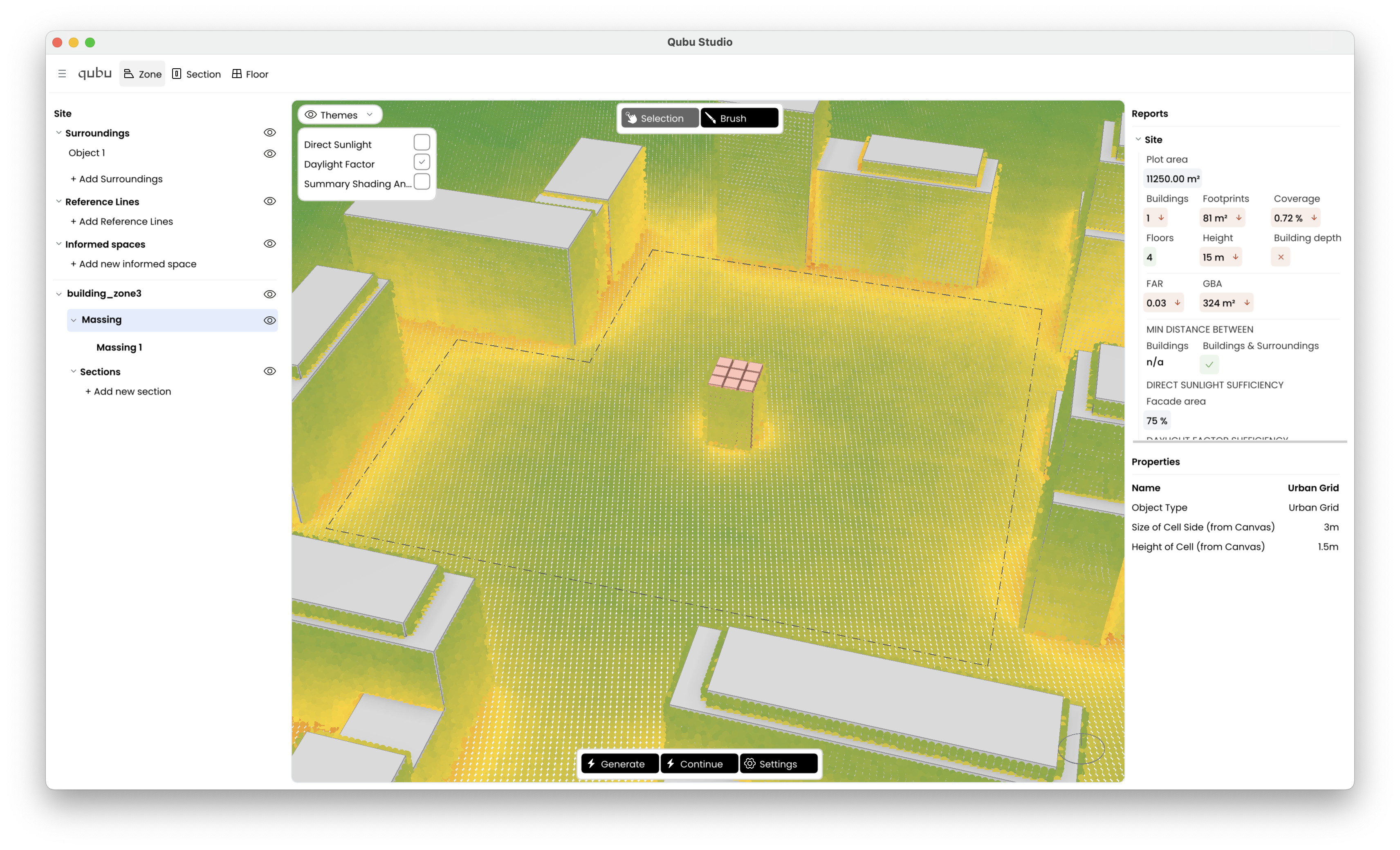
In Studio, Themes controls daylight visualization mode in the viewport. It does not control UI color skin, dark mode, or typography.
Location and UI
- The Themes button is near the top-left of the viewport area.
- Clicking the button toggles the Themes panel.
- The panel contains three checkbox entries.
Available modes
Themes maps to one daylight mode at a time:
- Direct Sunlight
- Daylight Factor
- Summary Shading Angle
Although the controls are shown as checkboxes, behavior is effectively single-select.